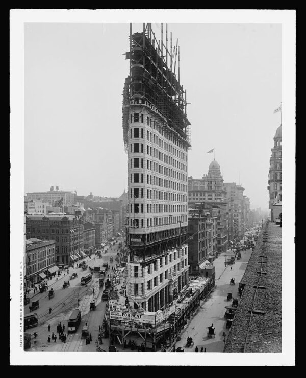
The Flatiron Building under construction, ca. 1902. (Via Library of Congress.)
Official website of the author

The Flatiron Building under construction, ca. 1902. (Via Library of Congress.)
Boston’s Old State House … was a perfectly normal-sized building when it was erected, in 1713. But today, surrounded by skyscrapers, it is completely transformed. It possesses a new charm, a charm its architect could never have envisioned: the charm of a tiny jewel or an exquisite ivory carving. Or a child. Among the tall, blank, dark buildings that surround it, the Old State House, with its slightly loony ornaments — a lion and a unicorn — resembles a child in Halloween costume being escorted around the neighborhood by the FBI.
What is true of the Old State House as a building is equally true of Boston as a city. Once Boston, too, was a city of average scale. That’s not the case anymore, not when you compare Boston with the typical American megalopolis, with its vast, bleak stretches of freeway and strip malls. By contrast, we’ve become Tiny Town.
Quite literally so. Boston comprises just 46 square miles of total area. Phoenix is 324, Los Angeles, 465, Honolulu, 596. The new Denver airport is bigger than all of Boston. You could put Louisburg Square in the center strip of many American downtown arteries and forget where you’d left it; it would resemble a minor traffic island. Or take our so-called skyscrapers. No fewer than 12 other US cities boast towers higher than the Hancock, our tallest. Chicago and New York between them have 22. There are several reasons why our buildings are smaller, the most important of which is that most of Boston’s subsoil is muck, not bedrock like Manhattan’s. By the time technology had solved the foundation problem, Bostonians were used to their smaller scale.…
[O]ur perception of scale has a lot to do with our life cycle as human beings. We were all small once, and we all got bigger. In that sense, we are all Alice in Wonderland: In our imaginations and our dreams, we’re always growing and shrinking. When we were little, a table was huge; we couldn’t see over the top of it. The memory of being so overwhelmed is one reason we enjoy miniatures, like doll houses and architectural models.… Why else do we flock to the famous “Main Streets” at Disneyland and Walt Disney World? All the buildings along these streets are built at three-quarters the size they would be in real life. The Disney people always get us right: In a world grown too big, we gravitate to a street that is just a little bit too small. It makes us feel more important, and it makes the world feel more manageable.
…When the “wrong” size is too big, it may command awe. When it is too small, it will often inspire love.
Boston, more than any other major American city, is a place that is filled with opportunities for that kind of affection.
Robert Campbell, “Small Wonders”
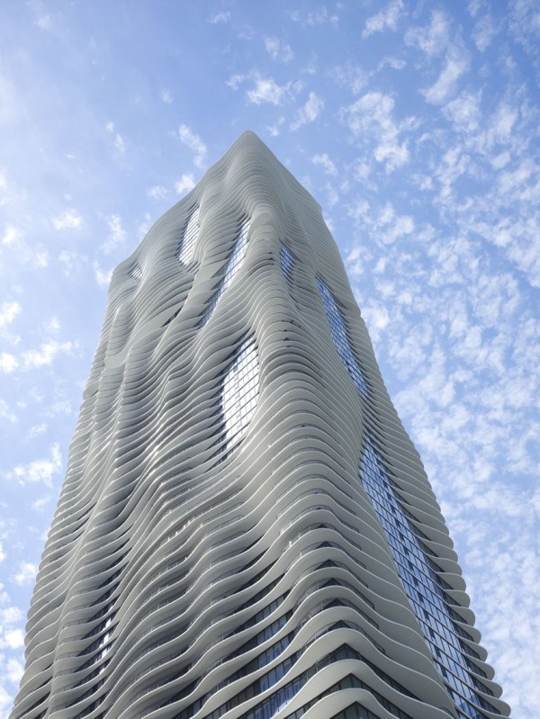
Designed by Studio Gang Architects.
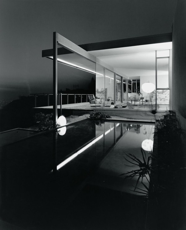
Richard Neutra’s “Chuey House,” Los Angeles. (via)
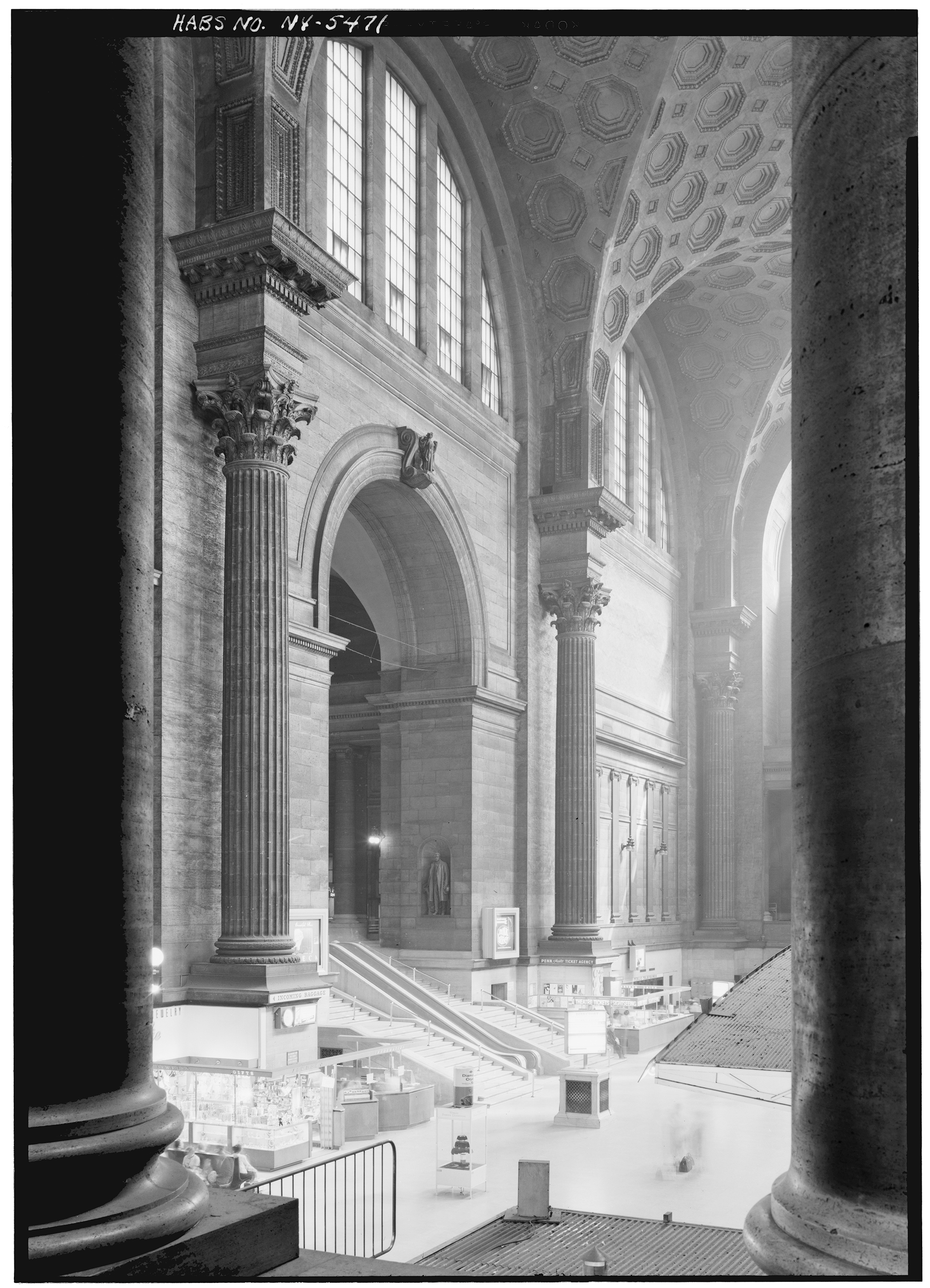
Pennsylvania Station, New York City. May 10th, 1962. Photograph by Cervin Robinson. (via)
Ask a Bostonian to name the ugliest building in the city, and nine out of ten will say “City Hall.” (The tenth will say something rude to you. If he does neither of these things, he is no Bostonian.) But architects love the building as much as everyone else hates it, and in this case the architects are right: City Hall is a treasure. It is one of the very few truly significant and daring buildings this conservative city has from the entire twentieth century.
What City Hall needs is not tearing down, as the mayor has suggested, but fixing up. It is badly maintained, badly lit, badly furnished. Worst of all, it is surrounded by a barren, windswept, forbidding plaza that is an unqualified disaster.
But reimagine City Hall Plaza as a green space thick with trees and walking paths, a mini Central Park or Arboretum. Or reimagine it as a bustling open market. Reimagine the plaza, basically, as anything other than what it is, so long as it is warm and alive, with City Hall rising up out of it like a stone outcropping of the hillside it’s built on. Not cold and “brutalist” but geometric and permeable and funky — and unabashedly modern. Add shops and cafes to bring people inside, especially in winter. Open the roof as a public space overlooking Faneuil Hall. Imagine City Hall crawling with people like an ant hill or a coral reef or a playground structure! It would be worth any dozen of the forgettable glass boxes or tubes we’ve put up here in the last century.
ArchitectureBoston magazine — itself a little-known treasure of the city — devoted an issue to reimagining City Hall in 2007. Editor Elizabeth Padjen invited me to chip in with a non-architect’s impressions of the building. You can read my piece here (PDF) and the whole issue here [update: link no longer available]. I highly recommend the magazine. The architects’ visions for a renewed City Hall [update: link no linger available] may change your mind about this despised but important building whose failure leaves a hole at the very navel of our city.
(I am in the process of gathering up some of the scattered pieces I’ve written over the years and linking to them here on this blog. That way the good people at the Library of America won’t have to hunt around for my collected works when the time comes. I’ll link to them all using the tag Other Writing.)
Photo credit: “Upsidedown Ziggurat” (licensed under Creative Commons).