Brilliant cover art for Walter Benjamin’s The Work of Art in the Age of Mechanical Reproduction. Designed by David Pearson for Penguin’s Great Ideas series, vol. 3 (2008). (Via Flickr.) Perfect.
Official website of the author

Brilliant cover art for Walter Benjamin’s The Work of Art in the Age of Mechanical Reproduction. Designed by David Pearson for Penguin’s Great Ideas series, vol. 3 (2008). (Via Flickr.) Perfect.

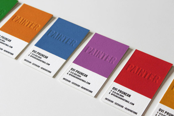
Letterpress business cards for a painter. Designed by the painter’s brother, James Prunean. Great design. (via)

There is not much left to say about the LeBron James debacle. There is enough harrumphing already about James’s narcissism. (Good examples here, here, here or, well, anywhere you look today.)
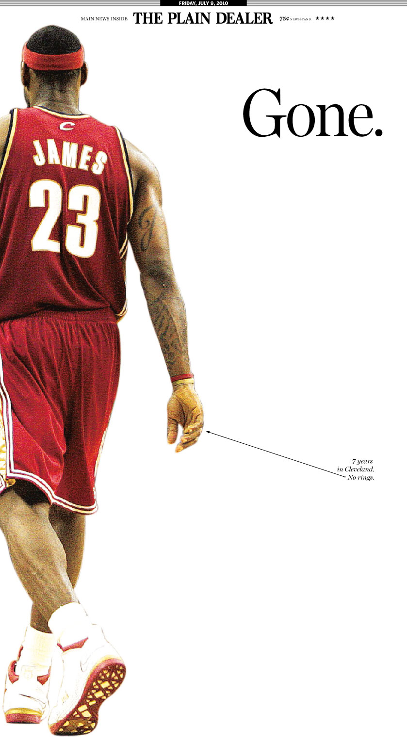
But at least one good thing came out of it: this memorable front page of the Cleveland Plain Dealer. What a brilliant minimalist design. Great use of white space. Smart idea to position the image at the left margin to open up even more empty space in the center. The one-word, unbolded headline with a dainty little period to emphasize its brevity and completeness, set lower than an ordinary headline, in that sea of white. This is essentially a design for a poster, not a newspaper. It throws out all the usual rules for newspaper layout: no grids, no columns, minimal text. And it works beautifully. The simplicity eloquently captures what Clevelanders must have felt this morning — speechless. Here, less truly is more.
The only nitpick I have is the little arrow pointing at James’s ringless hand. (Click image to view full size.) The caption reads, “7 years in Cleveland. No rings.” Well, yes, but not exactly the whole story. LeBron is the best player on the planet at the moment, rings or no rings. But then, given Cleveland’s misery, maybe that bitter note expresses the city’s mood, too. When you get dumped, you feel hurt but also pissed off, betrayed, and sometimes you need to say stuff like this.
So bravo, Cleveland Plain Dealer! No amount of clever graphic design will save the dead-tree newspaper business in the long run, but who knows? Maybe sophisticated work like this will win readers in the brave new digital world.

Designer Michael Tyznik’s concept for a redesign of American currency (rejected, of course).
Ask a Bostonian to name the ugliest building in the city, and nine out of ten will say “City Hall.” (The tenth will say something rude to you. If he does neither of these things, he is no Bostonian.) But architects love the building as much as everyone else hates it, and in this case the architects are right: City Hall is a treasure. It is one of the very few truly significant and daring buildings this conservative city has from the entire twentieth century.
What City Hall needs is not tearing down, as the mayor has suggested, but fixing up. It is badly maintained, badly lit, badly furnished. Worst of all, it is surrounded by a barren, windswept, forbidding plaza that is an unqualified disaster.
But reimagine City Hall Plaza as a green space thick with trees and walking paths, a mini Central Park or Arboretum. Or reimagine it as a bustling open market. Reimagine the plaza, basically, as anything other than what it is, so long as it is warm and alive, with City Hall rising up out of it like a stone outcropping of the hillside it’s built on. Not cold and “brutalist” but geometric and permeable and funky — and unabashedly modern. Add shops and cafes to bring people inside, especially in winter. Open the roof as a public space overlooking Faneuil Hall. Imagine City Hall crawling with people like an ant hill or a coral reef or a playground structure! It would be worth any dozen of the forgettable glass boxes or tubes we’ve put up here in the last century.
ArchitectureBoston magazine — itself a little-known treasure of the city — devoted an issue to reimagining City Hall in 2007. Editor Elizabeth Padjen invited me to chip in with a non-architect’s impressions of the building. You can read my piece here (PDF) and the whole issue here [update: link no longer available]. I highly recommend the magazine. The architects’ visions for a renewed City Hall [update: link no linger available] may change your mind about this despised but important building whose failure leaves a hole at the very navel of our city.
(I am in the process of gathering up some of the scattered pieces I’ve written over the years and linking to them here on this blog. That way the good people at the Library of America won’t have to hunt around for my collected works when the time comes. I’ll link to them all using the tag Other Writing.)
Photo credit: “Upsidedown Ziggurat” (licensed under Creative Commons).